1823 Service Redesign
Bridging E-Government and E-ParticipationOverview
Sector
E-Government, Civic Technology, Participatory Design, Public Sector InnovationThis research-driven redesign reimagines Hong Kong’s 1823 citizen service as a participatory, user-centric platform. By combining ethnographic research, digital service design, and iterative prototyping, the project explores how civic engagement can be strengthened through better UX.Challenge
Policy and Literature Review, Stakeholder Mapping, Semi-Structured Interviews, Service Blueprinting, Thematic Analysis, Information Architecture Redesign, Prototype User TestingMethod
Project Time
6 MonthsRole
UX Researcher and DesignerDISCOVERThe Challenge
1823 is one of Hong Kong’s key public enquiry and complaint channels, but its digital experience remains largely task-oriented. While users can submit enquiries, complaints, suggestions, and compliments, the platform offers limited visibility into how public feedback progresses or contributes to broader civic participation. The challenge was to redesign 1823 into a clearer, more transparent, and more engaging public service experience.RESEARCHUnderstanding Public Service Patterns
To inform the redesign, I studied global e-government and e-participation platforms, including examples from Iceland, Spain, Estonia, South Korea, Singapore, and Taiwan.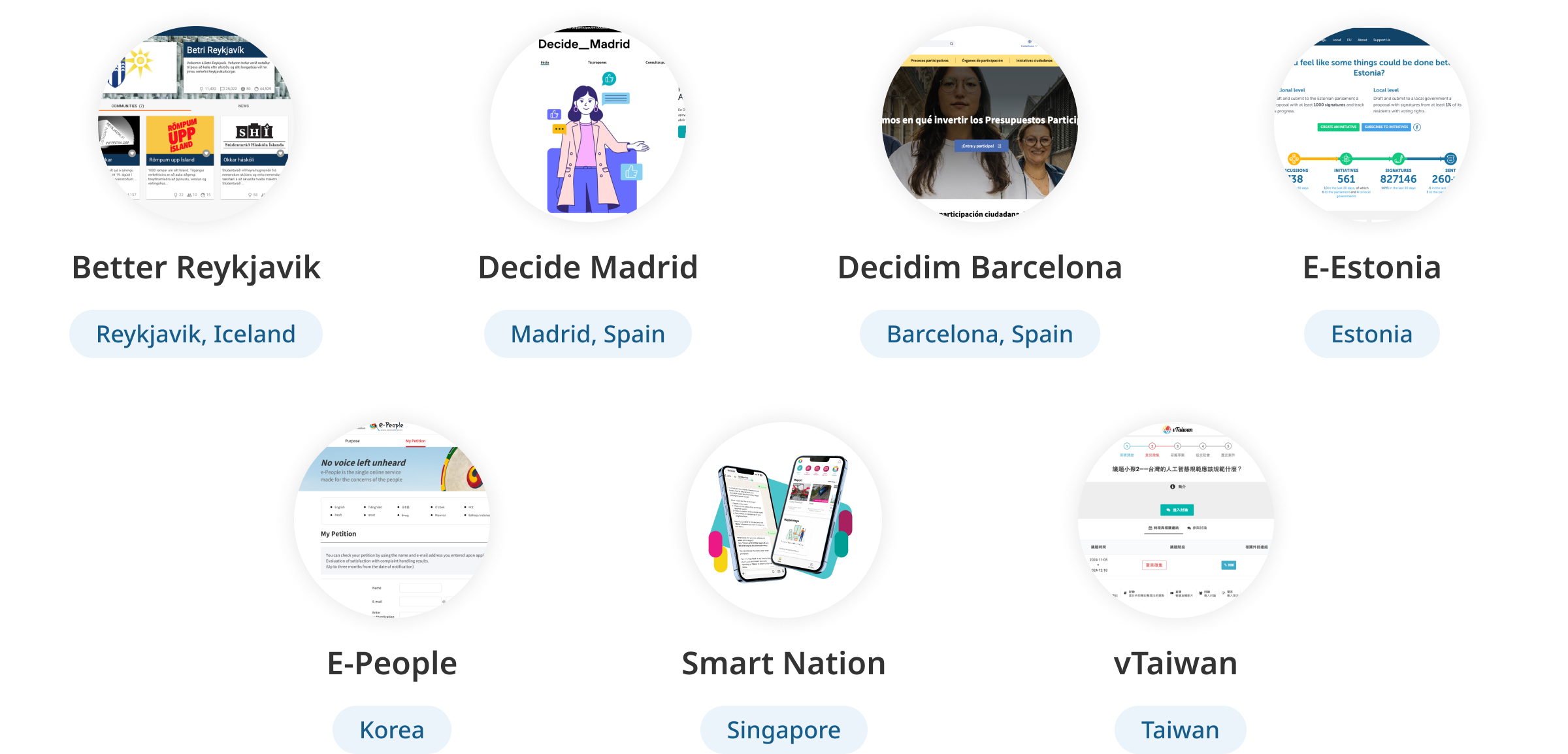
The research focused on how public service platforms support: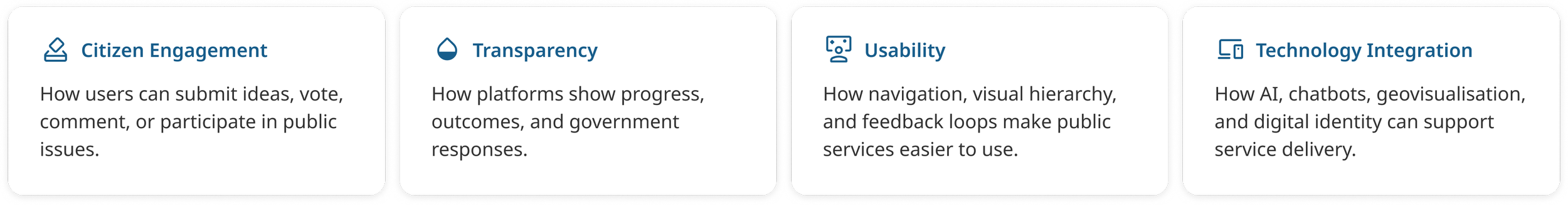
DESIGN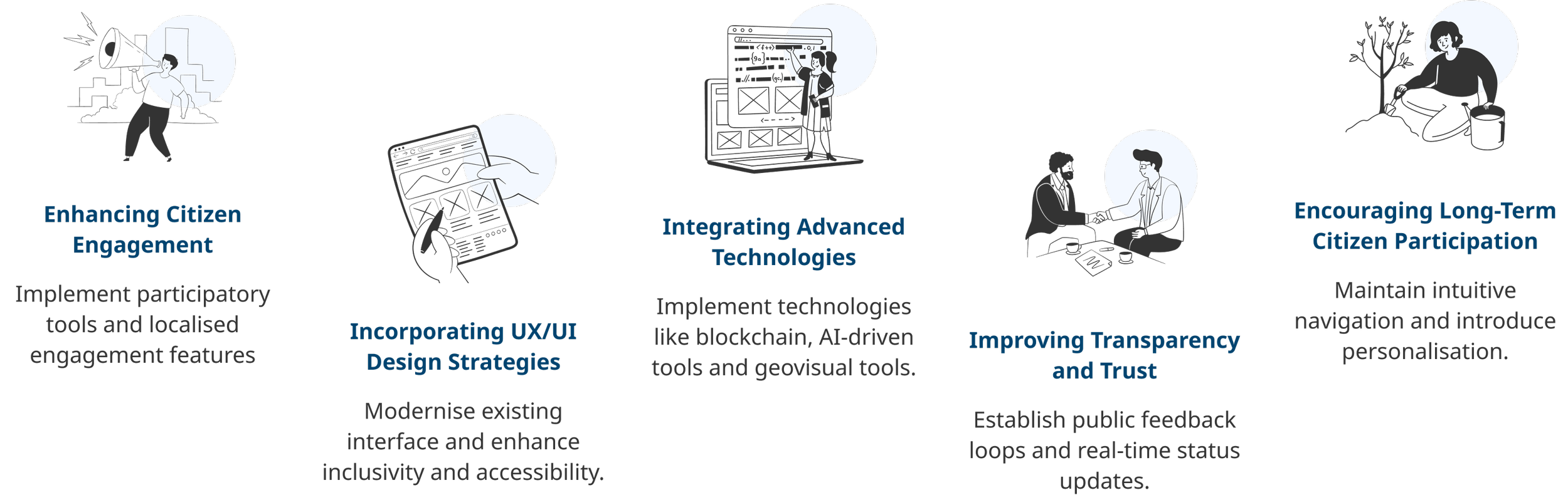
Redesign Proposal
VISUAL SYSTEMCreating a More Trustworthy Civic Interface
The visual system was refined to make 1823 feel clearer, more accessible, and more trustworthy while preserving its public service identity. The goal was to reduce visual clutter and create a more modern interface for complex service information.01 Brand Identity – Simplifying the logo for digital use
The original logo communicated dialogue, but its overlapping shapes and serif numerals made it less adaptable for digital interfaces. I redesigned it into a cleaner chat bubble mark, paired with a shorter “1823 GOV” wordmark. Orange was used to keep the identity warm and approachable, while blue reinforced trust and authority.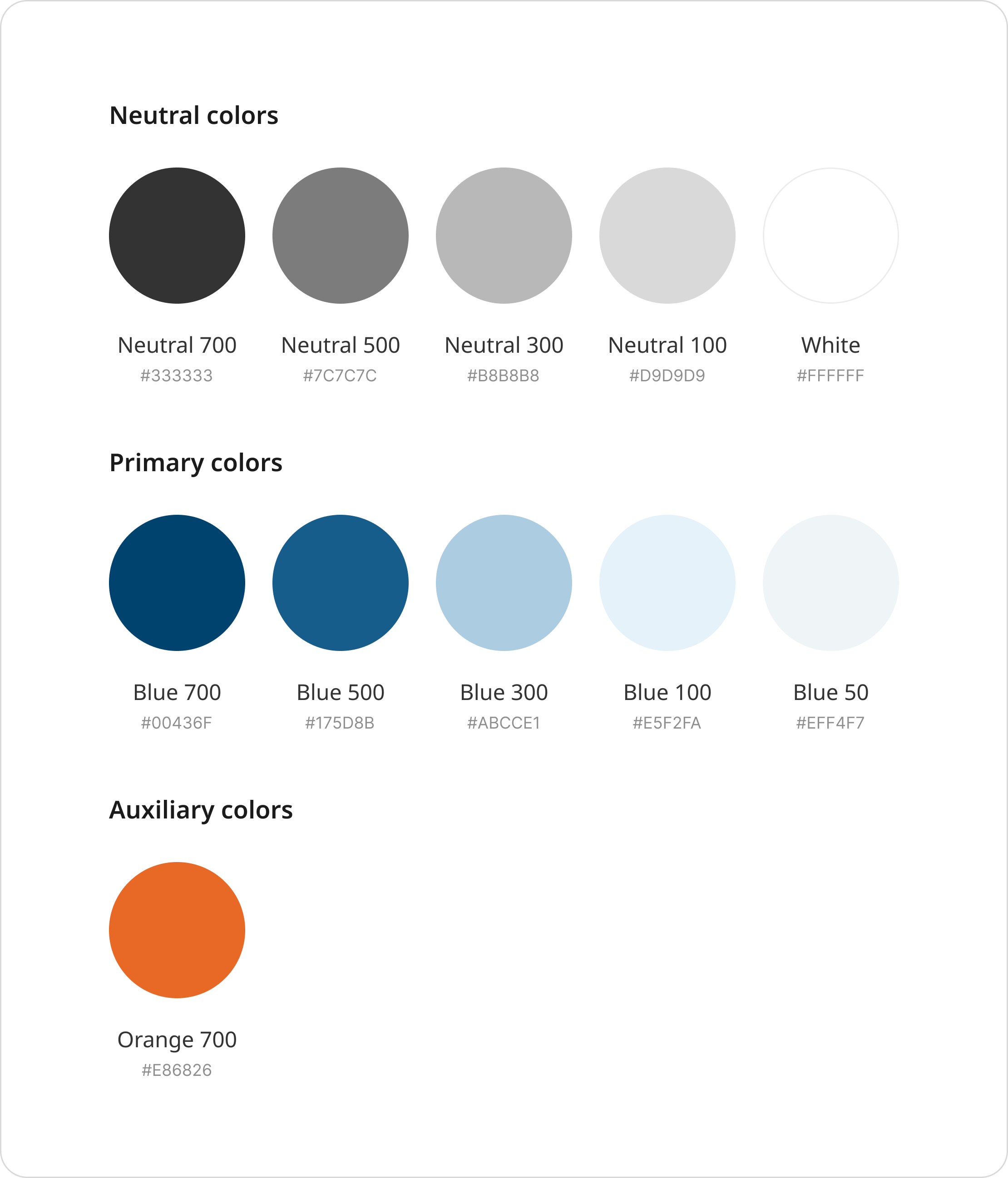
02 Colour System – Balancing trust, clarity, and action
The blue palette was darkened and expanded to improve contrast, readability, and hierarchy across the interface.Orange was kept as the accent colour for CTAs, alerts, and key interactive moments, helping users quickly identify where action is needed.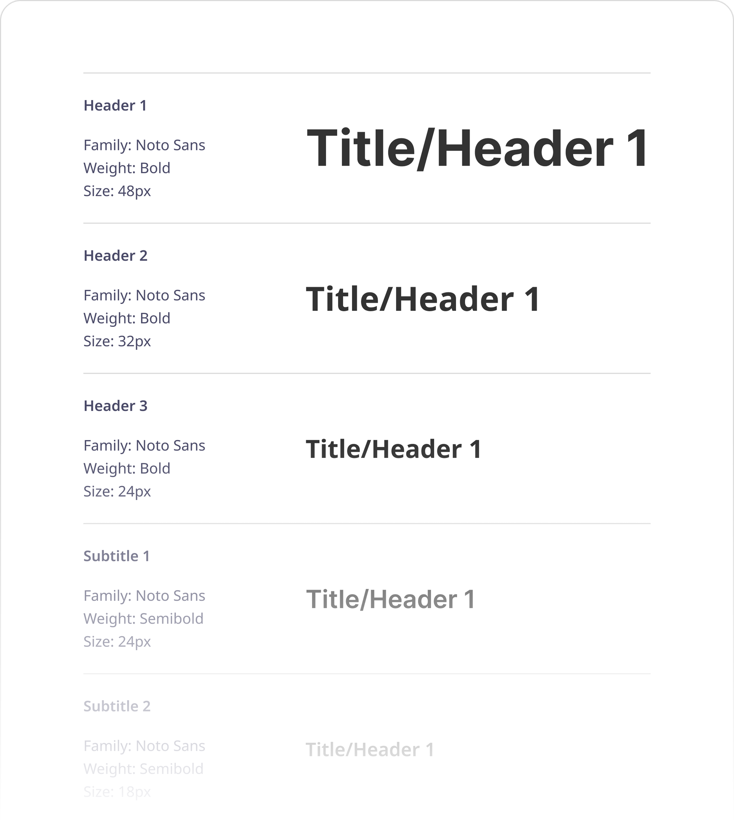
03 Typography – Readable across languages
Noto Sans was selected for its clean appearance, strong readability, and multilingual support. The type scale was designed to make service content easier to scan, from page titles and section headings to form labels and helper text.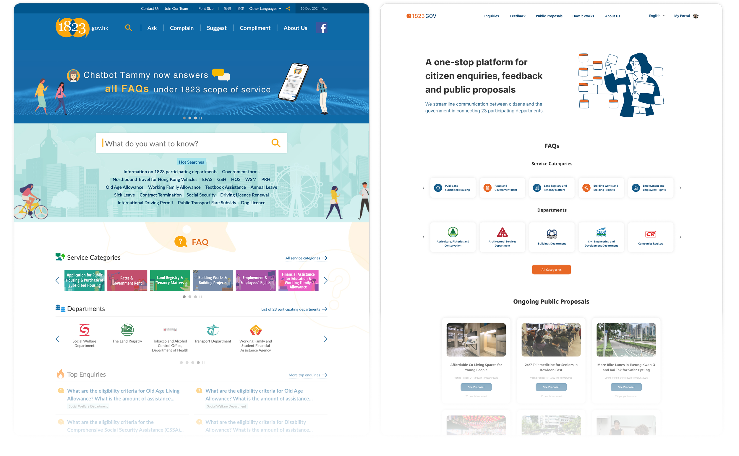
04 Layout and Components – Reducing cognitive load
The interface uses more white space, card-based grouping, rounded containers, and consistent components to make complex public service information easier to understand.
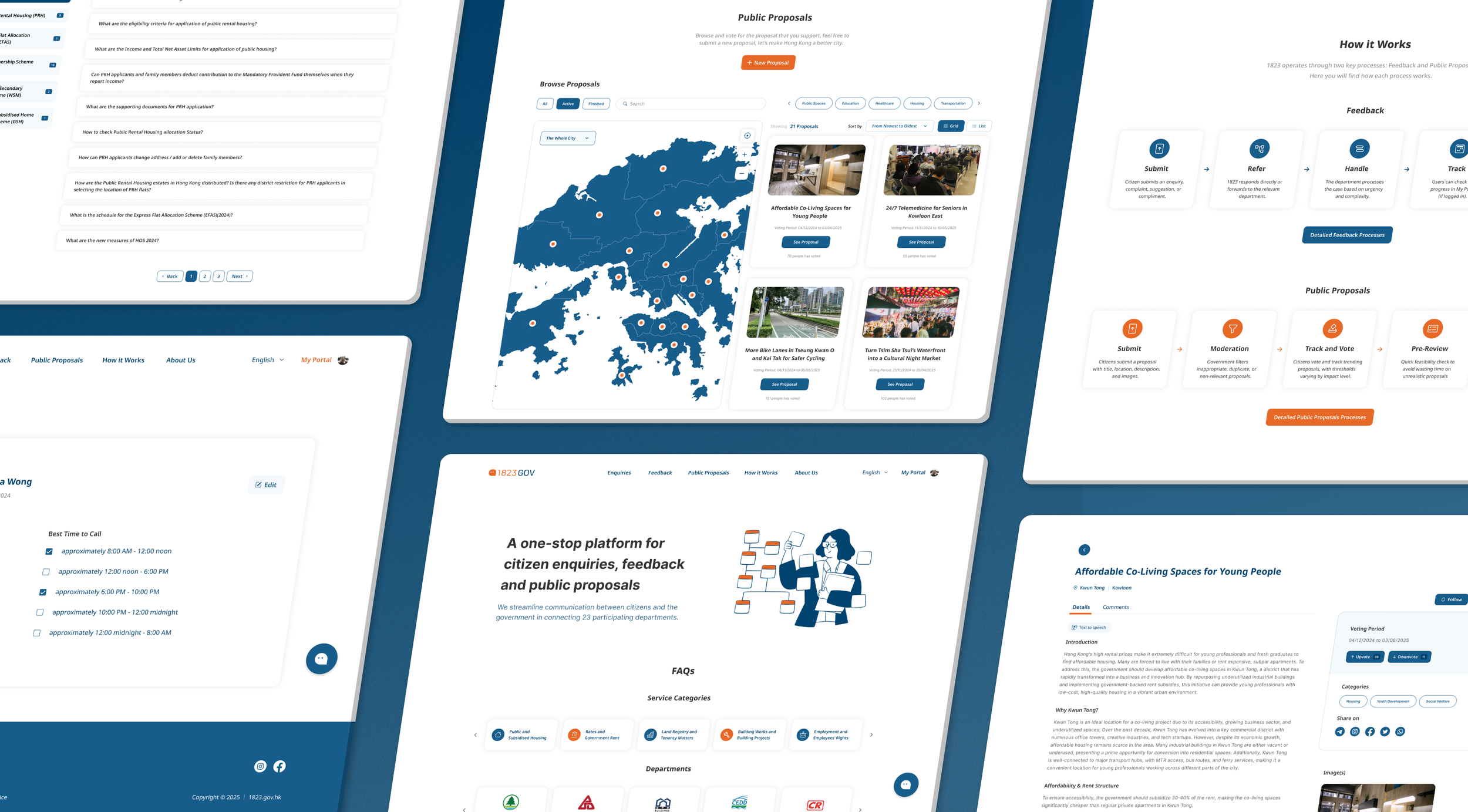
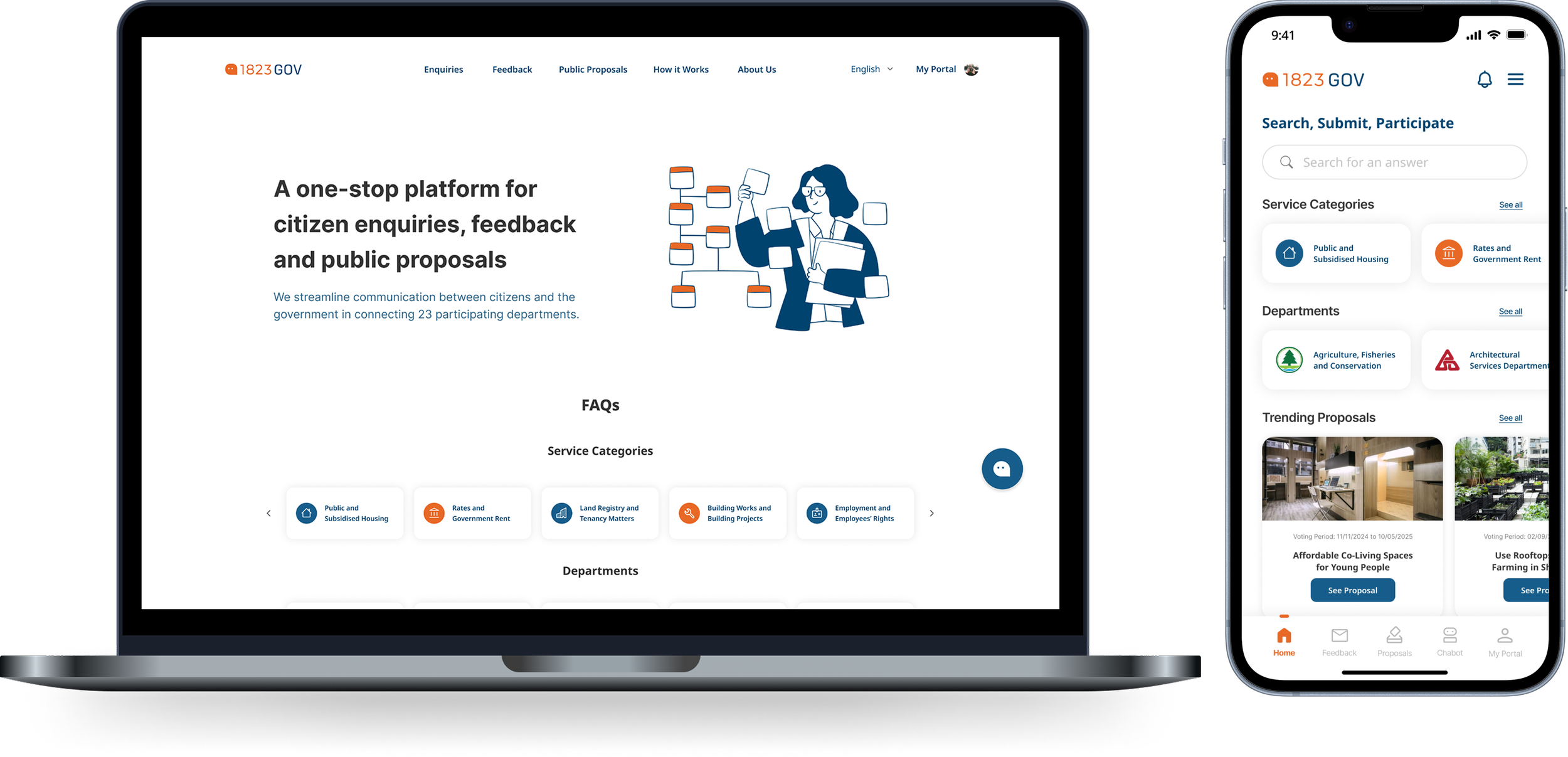
Repeated patterns were used across feedback forms, proposal cards, status labels, navigation, and chatbot support to make the experience feel more predictable.PROTOTYPEExplore the Live Prototype
A browsable prototype was created to show how the redesigned 1823 experience works across navigation, feedback submission, public proposals, My Portal, and AI-assisted support.
VALIDATEExpert Evaluation
The prototype was reviewed by experts from UX/UI design, programming, and governance/policy backgrounds. The redesign received positive feedback on navigation, visual clarity, process transparency, and accessibility.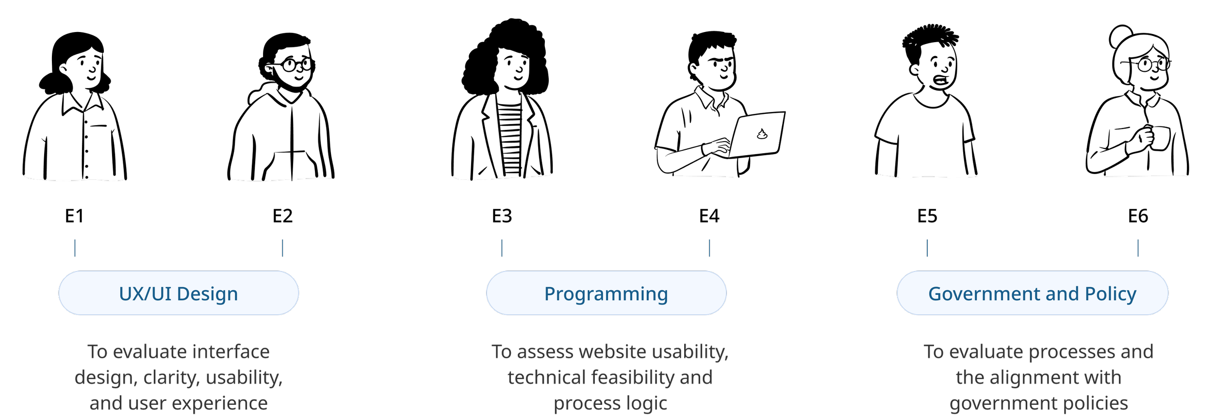
The SUS score improved from 35.0 for the existing platform to 81.3 for the redesigned prototype, suggesting a significant usability improvement.