1522 Anti-Violence and
Anti-Stalking Service
Overview
Sector
Crisis Support, Public Service, Anti-ViolenceThe public service's app needs to be redesigned to enhance the overall service efficiency and user experience, including restructuring the app's functionalities and information architecture, and developing a coherent visual language. Challenge
Benchmarking, Heuristic Evaluation, Open & Closed Card Sorting, Tree testing, Wireframe & Prototype User TestingMethod
Project Time
3 MonthsRole
UX Researcher and Designer1522 was launched in 2006 by the Department for Equal Opportunities with the aim of developing a broad system of action for the emergence and contrast of the phenomenon of intra and extra-family violence to the detriment of women. The majority of its services happens in the public utility number 1522 and an mobile application.Throughout the project, we investigated the user pain points and expectations to the service and the current shortcomings in the app, and thus to construct a redesign plan for the system, conduct user testing and generate prototypes as the outcome. DISCOVERBackground Investigation
We started the project by identifying the 3W-1H of the service and the main functionalities of the app. Then benchmarking and competitive analysis (SWOT) were done to explore the current market composition and potential development direction of the redesign proposal. To gain a basic understanding of the social needs of the 1522 service, we have also conducted desk research to gather data about the anti-violence and anti-stalking policies and crime categories under the European context.DEFINEExpert Evaluation
In the defining stage, we performed a heuristic evaluation to identify and address usability issues within the 1522 app. We began by selecting and analyzing four essential tasks related to the 1522 line service and applied the ten usability heuristics for user interface design as our primary evaluation criteria. The evaluation uncovered specific usability issues, and our analysis emphasized key points that could be improved. By adhering to these usability heuristics, we pinpointed areas where the app needed enhancement, providing concrete examples and actionable recommendations for further development.
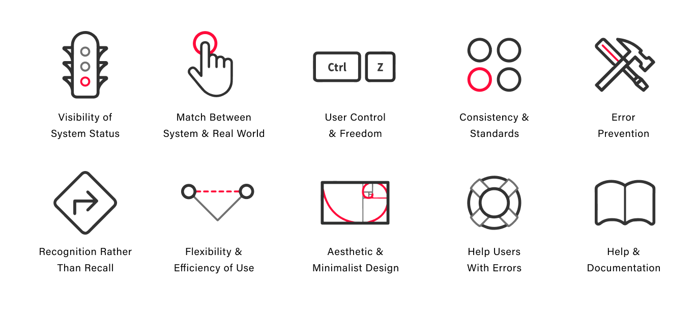
After the evaluation, we have identified four main problems and suggestions:Main problems
Visibility of System Status
Lack of optimization for all OS systems.Match Between System and Real World
Lack of connection with emergency services and authorities that may assist in real time.User Control and Freedom
Blocked chats, lack of shortcuts and small text size.Consistency and Standards
Mixed use of languages and lack of UI consistency.Suggestions
Update and Inform
Constantly integrating OS updates to improve responsiveness, usability, and integration with phone’s accessibility features.Design System
Designing and applying a definitive design system.Shortcuts and Integration
Redesigning to prioritise shortcuts for important features to speed up interaction times of the users.Make User’s Experience Easier
Allowing a good integration with emergency services and real-time connection to allow the user fast and effective access to help.DEFINEUser Testing
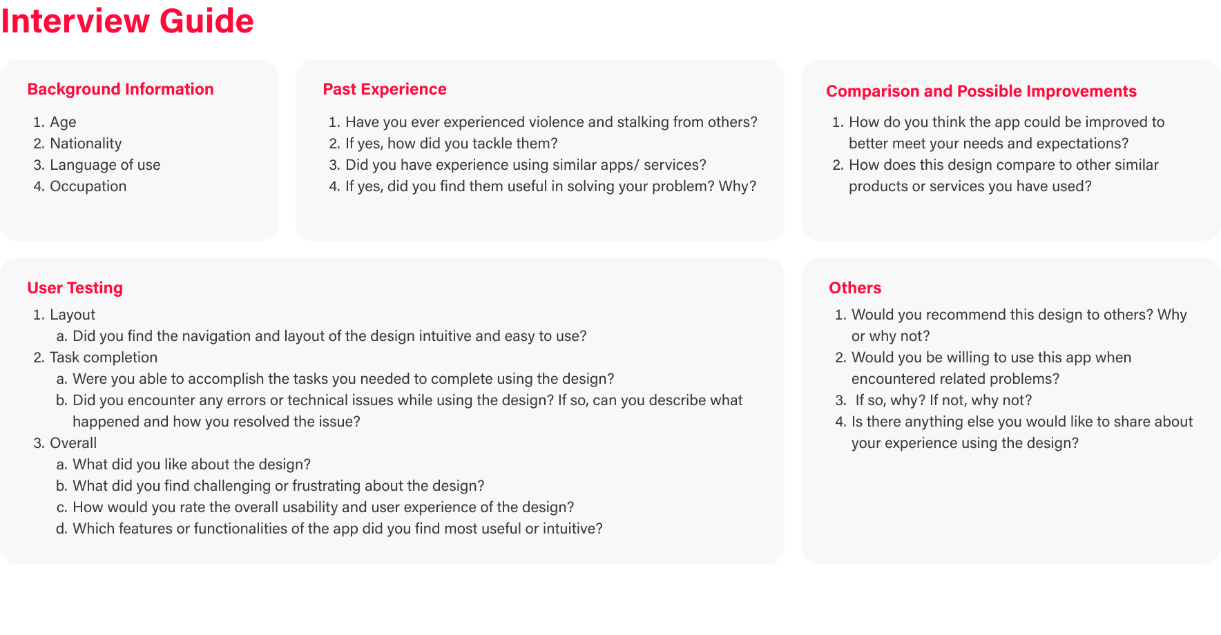
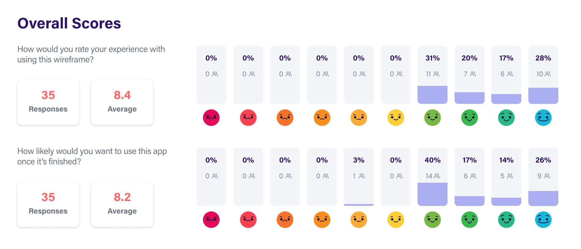
In our efforts to gather comprehensive insights from users of the app, we employed a combination of research methods tailored to our diverse target audience, which included females of various ages and nationalities with proficiency in languages that the service supports such as Italian, English, French, Spanish, and Polish.

Using purposive sampling, we recruited eight users who sequentially completed four pre-defined tasks within the app. Following task completion, participants provided ratings through the System Usability Scale (SUS) assessment and Microsoft Reaction Card.

Additionally, we conducted in-depth interviews with each participant to delve into their detailed personal and internal experiences with the application. This multi-faceted approach allowed us to gain comprehensive insights into user interactions, usability, and overall satisfaction with the app.
Drawing from a rich dataset comprising both quantitative metrics, including task completion rates, task success rates, and time-on-task data, as well as qualitative metrics encompassing user satisfaction, ease of use, and overall experiential impressions obtained through the System Usability Scale (SUS) questions and thematic analysis of interview responses, we have identified five key focal points within our redesign proposal:
DEVELOPMENTDefining Information Architecture
To shape the app's information architecture, we employed open and closed card sorting along with tree testing. Open card sorting allowed users to organize content based on their mental models, closed card sorting assessed alignment with existing categories, and tree testing evaluated the efficiency of the proposed structure. These methods guided our efforts to enhance findability and user satisfaction through improved information organization.
Based on the collected results, we have defined the information architecture as follows: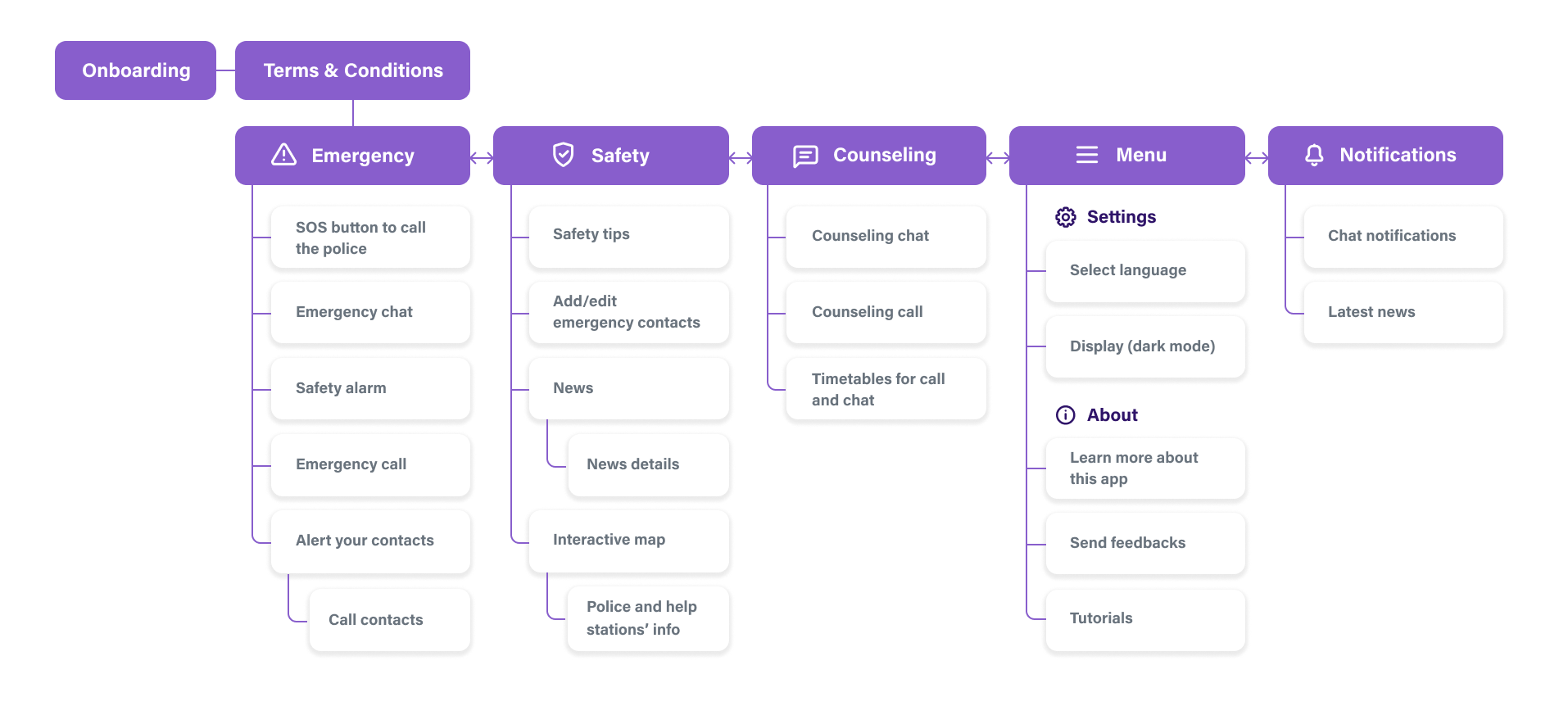
TESTWireframing

The wireframe was crafted in alignment with the established information architecture, featuring two primary navigation patterns – tabbed view and hub & spoke. The wireframe design prioritized a classification principle, enabling users to navigate content through multiple pathways.We then performed user testing based on seven tasks:You want to add a friend as an emergency contact.You want to search for nearby help centres and view the details of the nearest one.You want to keep track of the latest news related to anti-violence and stalking.You are facing psychological abuse from your boyfriend, and you feel sad and want to chat with professionals for advice.There are some functions that you don’t really understand how to operate, so you want to find instructions on how to use the app.You are facing emergency and want to call 112 immediately.You want to activate safety alarms and to alert your emergency contacts that you are in danger.

Following user testing and feedback, we made wireframe modifications and advanced to the prototyping stage.DELIEVERDesign System and Prototyping
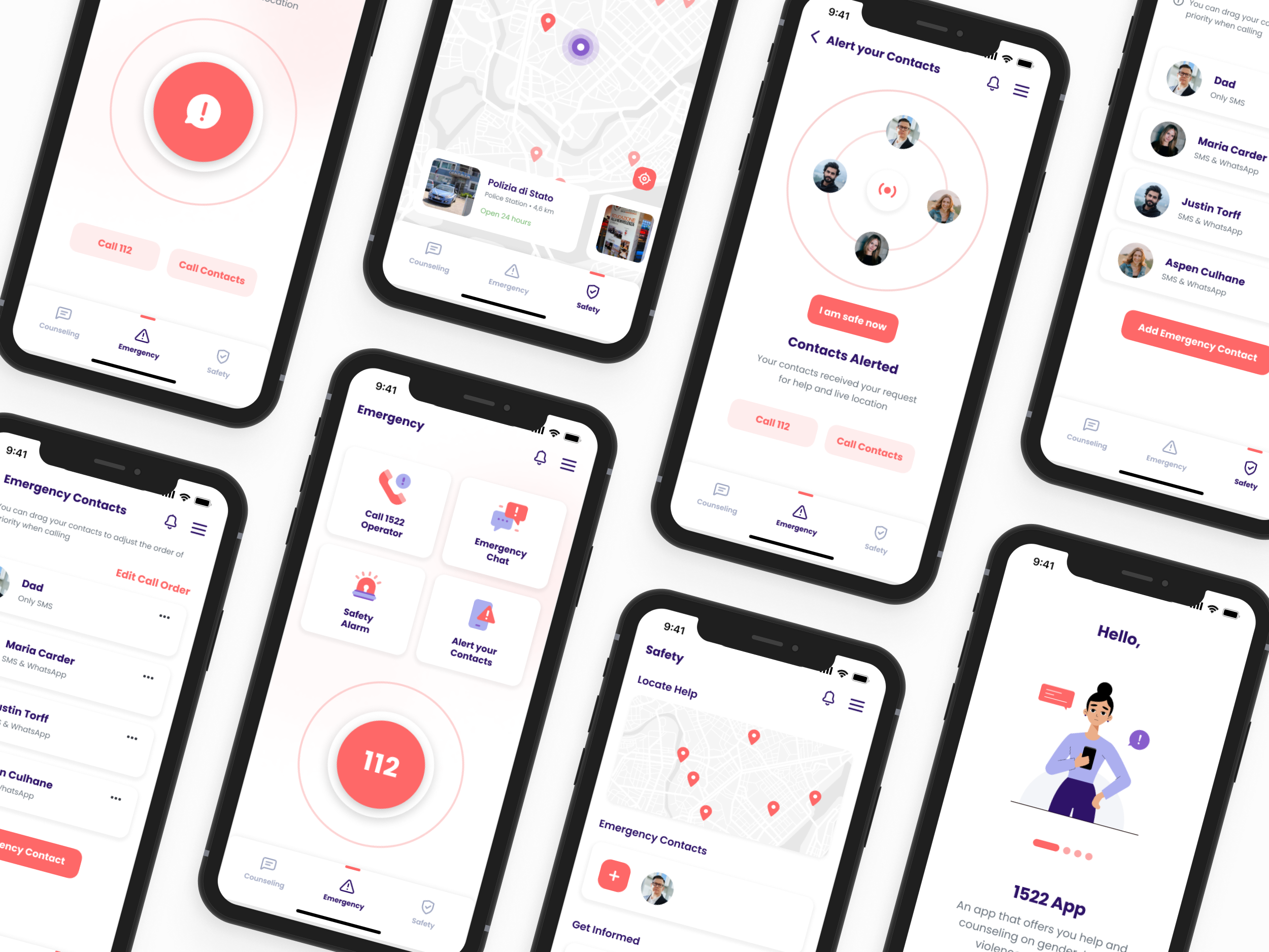
As we transitioned to crafting the design system, we retained the original app's primary color, desaturating it to a salmon hue for a friendly and approachable feel. Additionally, we introduced a secondary color, purple, selected for its significance in the feminist community, resonating with themes of women empowerment.
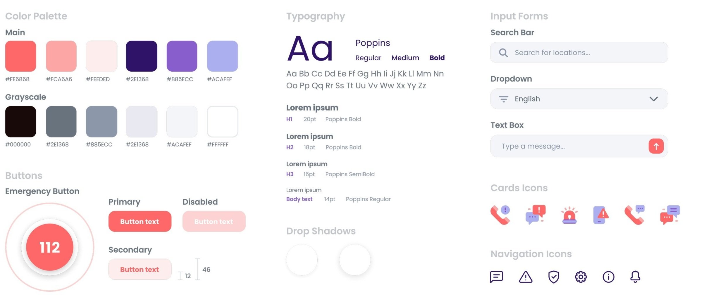

The final prototype's architecture incorporates onboarding and terms and conditions agreement elements, along with enhancements for adding and alerting contacts, informed by earlier testing phases.The dark mode was developed to cater the users’ needs, aiming to avoid eye-straining and preserve battery consumption. And most importantly, to facilitate discreet usage in case of danger. 
In the journey to enhance the 1522 app's user experience, our rigorous process of evaluation, user testing, and iterative design yielded a refined final prototype. We systematically gathered user insights, optimized the information architecture, and developed a comprehensive design system, including the introduction of dark mode for added usability. The architecture now includes essential elements like onboarding and terms and conditions, as well as improvements for adding and alerting contacts, all rooted in user feedback. This process not only improved usability but also contributed to a more inclusive and secure user experience, aligning with the app's mission. We are excited about the positive impact these changes will have on users and look forward to its continued evolution.